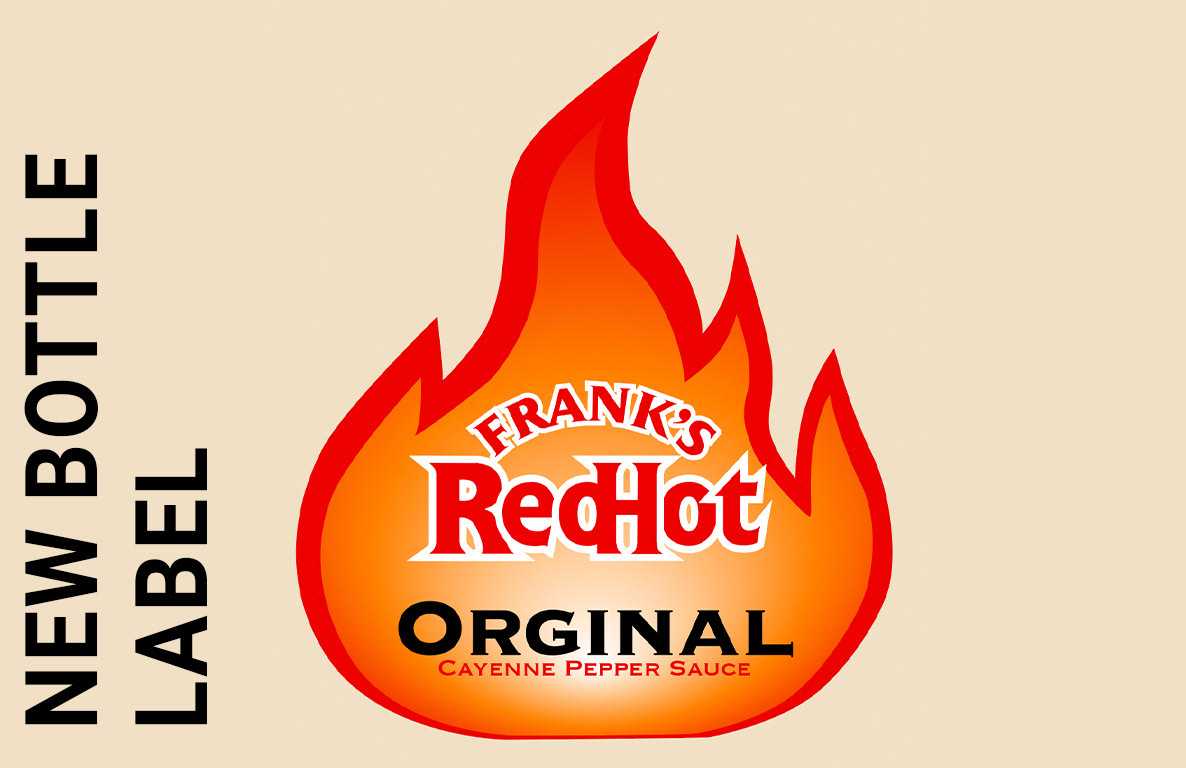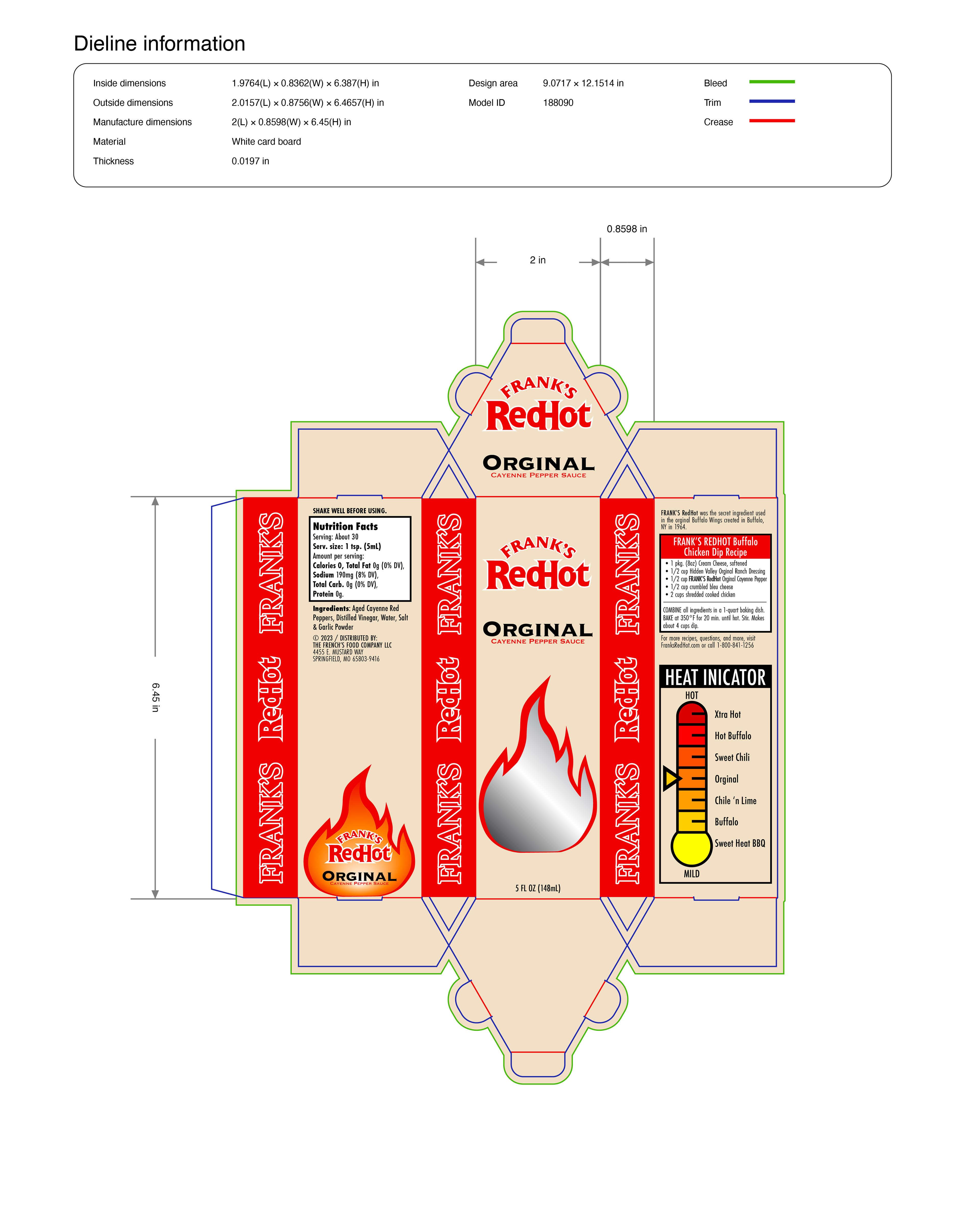

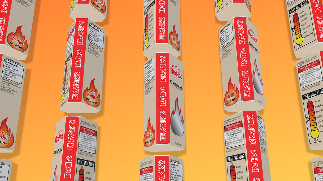
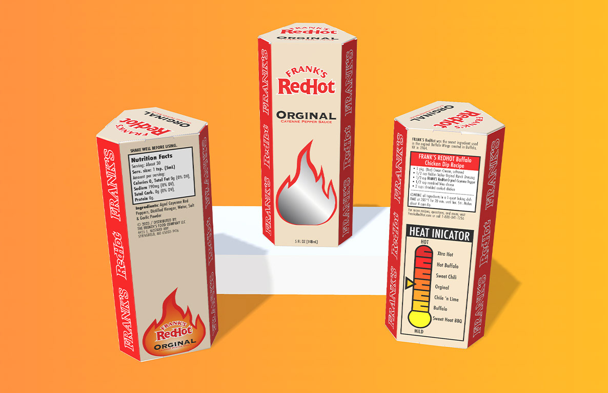
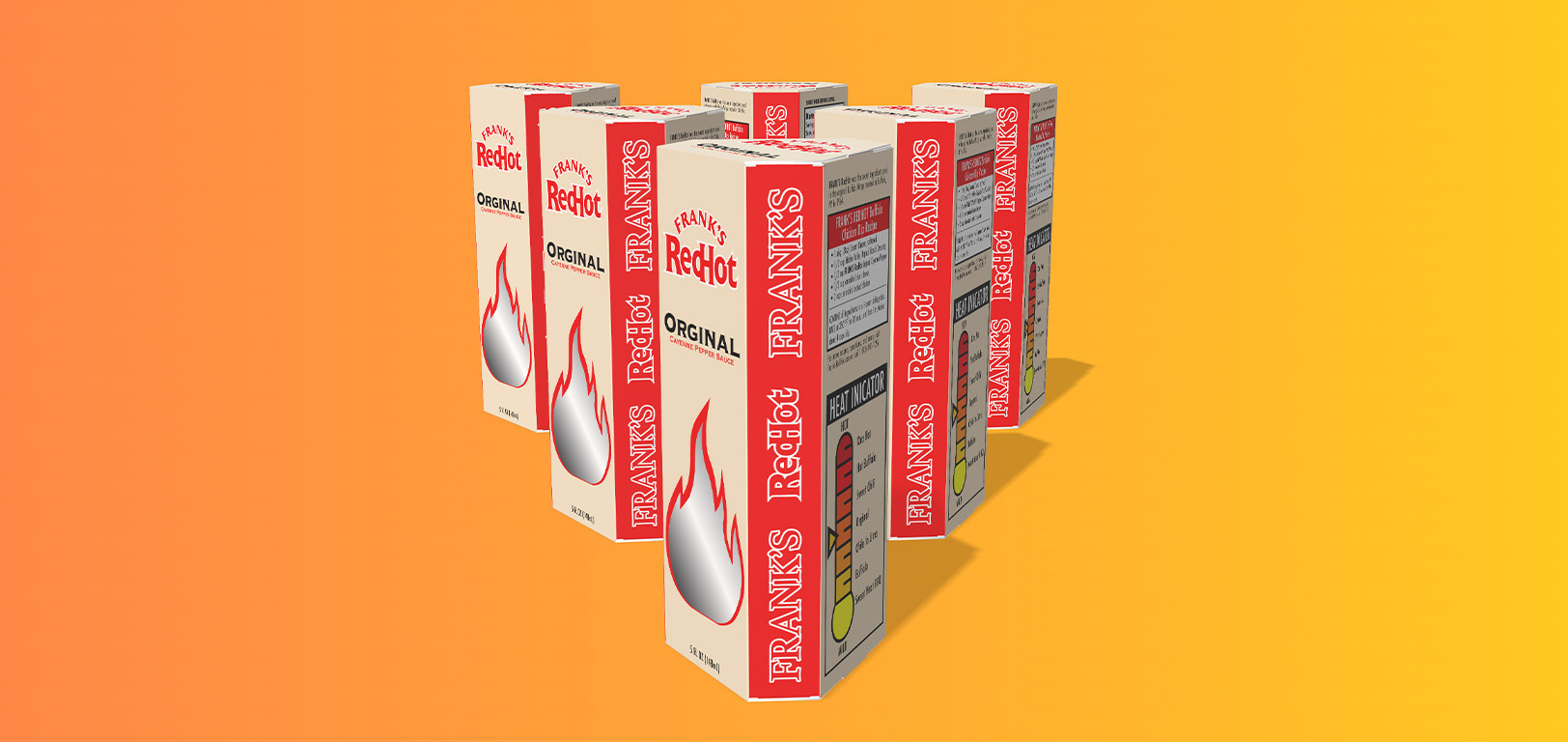
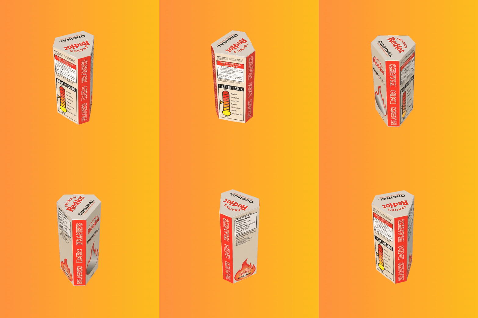
This project involved creating a packaging box for Frank’s RedHot that could hold one bottle securely and communicate the product’s attitude. A hexagonal box structure was used to give the packaging a more unique, eye-catching form while still supporting the bottle. From there, a layout that balanced branding, nutritional information, and graphic elements while maintaining consistency with the brand was developed.
Design Details
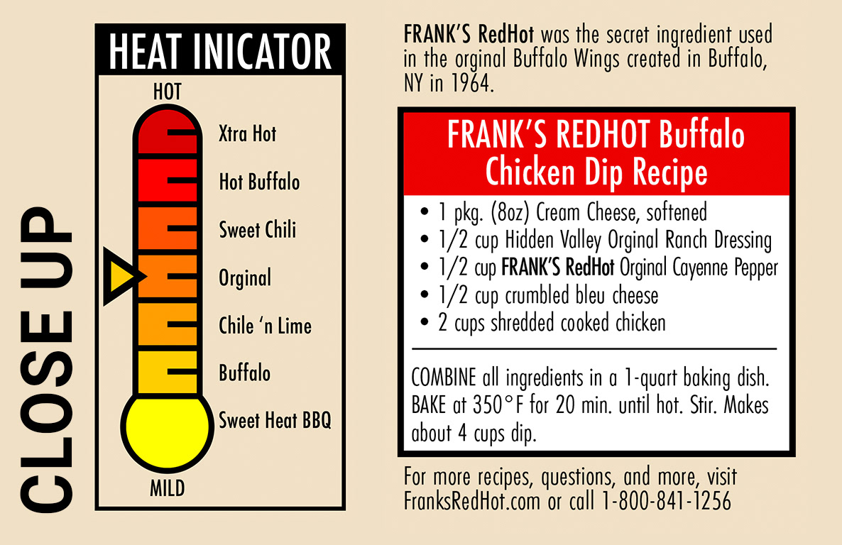
All of the essential information from the original Frank’s RedHot packaging, such as the recipe, heat indicator, and brand messaging, was kept, but the layout was reworked to fit my packaging design. The information was redesigned for better readability and a more cohesive visual structure, while still staying close enough to the original design to feel authentic to the brand